|
|
Post by The Mad Plumber on Jan 2, 2009 2:23:32 GMT -5
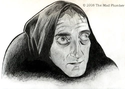
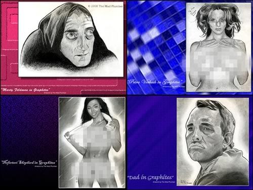
Many thanks to the administrators and programmers of The Discussion Board for setting up this folder. I hope this proves as an enjoyable medium to share my works and thoughts. I suppose I'll start off with this drawing I finished rendering back in October. I was glad to have finished my Feldman rendering before Halloween. My feelings are mixed about this piece; while I feel that this is probably the best graphic pencil drawing I had ever done as of yet, I still just feel it's not great. Maybe I'll get there. This is a reduced resolution version of the illustration to fit the forum posting. Those of you who wish to see a higher resolution version of this drawing can visit one of the following links. A work of caution to those of you who are considering visiting those sites or subscribing to my works: I do draw adult works and some of those sites are more liberal than others. Also, I have been a frequent critic of incompetent administrators at sites such as Fur Affinity and freely browsing around could expose you to obscene and offense materials posted by malicious users. If you have a moral or religious objection to pornography, I strongly advise you NOT to subscribe to my works. Feel free to leave replies. Thank you for visiting. |
|
|
|
Post by Afgncaap5 on Jan 2, 2009 20:17:43 GMT -5
Well, I personally think it looks great. And not just in a "it's better than I could ever do, so ergo it's good" fashion, I mean sincerely good looking. Specifically the furrows in the forehead, that's a touch I wouldn't have thought to add.
|
|
|
|
Post by Mighty Jack on Jan 7, 2009 5:22:37 GMT -5
I'm impressed.
|
|
|
|
Post by pinkfully on Jan 7, 2009 22:13:14 GMT -5
Wonderful drawing, you've captured his character beautifully.
pinkfully
|
|
|
|
Post by siamesesin on Jan 12, 2009 1:42:52 GMT -5
I like that the bags under his eyes are asymmetric. I know it's weird, but I always like seeing the reality of the human face.
It's very cool.
|
|
|
|
Post by The Mad Plumber on Jan 22, 2009 15:53:22 GMT -5
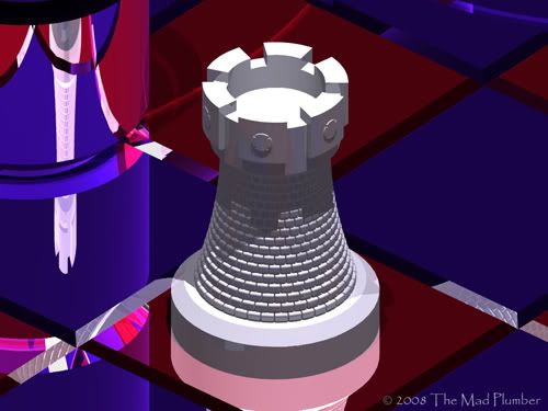
Here's two renderings I liked to share with you. Here's a story behind this one. In college, I took a couple drafting classes to improve my proficiency with AutoCAD. After one class session where my understanding of solid modeling was improved, I retreated to the computer lab where I began work on designing this AutoCAD model. After I had completed this knight, I designed and built models for the other Chess pieces; it is my opinion that none of them really measured up to this one. You will note that the complexity of the model is mostly two-dimensional. AutoCAD solid modeling does not permit the kind of complex modeling you can derive from software like Alias Maya (or Autodesk Maya as I believe it is now known as). Solid modeling is more so for scientific purposes, as you can use it to calculate volumes and other data. Building the model was actually more of an exercise to demonstrate how proficient I was with AutoCAD. The original renderings I produced from the AutoCAD models I designed were to serve as portfolio media in my efforts to find work as a draftsman. Probably inspired by something I read on Pixar's website, I began composing DVD slideshows of my projects that I would mail to hopeful employers. It really didn't work quite as well as I hoped. In fact, in one interview, the guy really seemed to be laughing at me. Maybe my choices of music were dubious; setting my Chess set slideshow to the tune of Led Zeppelin's "No Quarter" might have worked against me, and yet it seemed to fit so well. Ultimately, my portfolio really helped in no way in regards to getting any of the draftsman positions I held. Still, I sought to build to it. I later attempted to start a new Chess set that would be more stylized than my original set. Thus, I had designed and built this model to begin with. In retrospect, I shouldn't have UNIONed the bricks and should have had them classified as BLOCKs so as to keep the file size to a minimum. It takes a LONG TIME to render this model. I didn't create any more pieces after this one. I probably abandoned doing any further work to my portfolio when I resumed my job at the college working for the maintenance department. I probably became more interested in composing solid models of actual buildings; I made copies of the college's schematics to satisfy this desire. Later on, I would discover that one of the engineering buildings had acquired a three-dimensional printer. It is an absolutely fascinating tool. The three-dimensional printer uses plastic resins to create a physical representation of your AutoCAD models. I tested my Chess knight in the machine and, while the machine couldn't really produce the fine little details, I was very amazed with the result. The above images are of reduced resolution to fit the width of the blog. Those of you who are interested in viewing higher resolution versions of these renderings can visit their submissions at the following links. Again, please heed this warning: Do not subscribe to my works if you have a moral or religious objection to pornography. Furthermore, freely browse about these sites at your own risk; I cannot be held accountable for other malicious users and incompetent administrators. Feel free to share your thoughts. |
|
|
|
Post by Afgncaap5 on Jan 27, 2009 9:41:39 GMT -5
Lookin' nice. I play chess a reasonable amount, but have let it slip lately. I should get back into it.
|
|
|
|
Post by The Mad Plumber on Mar 18, 2009 10:33:38 GMT -5
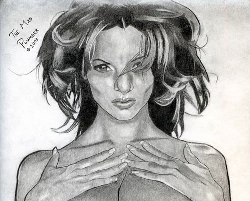
Thank you for visiting. I have just finished PROJECT #24 which is much of a relief to me. I have quickly wrapped up this lengthy project that has been bugging me for so long. This is a graphic pencil rendering of a Chris Peter Paul of Petra Verkaik, a Playboy Playmate who posed as Miss December 1989. Miss Verkaik is undoubtably my favorite all-time model and is to today still a beautiful woman. I have taken far too long on this project. This was intended as being a personal study of a woman of voluptuous and sensual dimensions, and that by drawing and valuing the drawing would make myself more attuned to the anatomy of a woman. I may have been fairly lethargic about finishing this drawing and in some ways it's just not as fun or easy to draw as a distinguished man's face. The time that this project consumed just doesn't really show. Mine is not the first rendering of Petra Verkaik and probably won't be the last, and mine is probably the most laughable. An element that I appreciate of Miss Verkaik is that I feel that she is of few glamour models with a distinctive and recognizable face. Petra's nose in particular is the one element of her that I feel gives her a great deal of individuality and helps give me some sort of comfortable anchor when I am trying to draw her or just admire her glamour shots. In valuing the drawing, I had to take extra attention as to how light fell of Miss Verkaik in the Paul photograph. I will admit that probably the first areas of the drawing that I had valued were Miss Verkaik's breasts. The shading was refined later through the application of a tortillion which I will discuss later. Other points of interest were the lighting below her sternum and the bone structure in her hands. In the Paul photograph, Miss Verkaik's pupil is not highly visible in her darkened corneas; thus, I took liberal license to manufacture a lit area in her corneas to prevent them from being solid black balls. I had originally used a tortillion only very briefly to soften a few hard lines in my Marty Feldman. With this rendering, I went back over all my valued areas with a tortillion to create a more distinctive texture. It allowed me to refine the shading of Miss Verkaik's breasts to where the light is now shown to be the brightess near her nipples. I'm not sure if the application of a tortillion is necessary in all drawings or if my extensive use represents that I was doing something terribly wrong in regards to valuing by pencil alone. This drawing was a delicate matter. I wanted to make the picture distinctive, but at the same time not render Miss Verkaik as being grotesque or unattractive. I feel that rendering Miss Verkaik in pencils has somehow taken away the beauty that was already perfectly captured by Paul on film. Nevertheless, I am hoping that I have learned something through the drawing. Hopefully, should I do future renderings, the time consumed will not be as extensive and that they will help influence my manga-inspired renderings in the future. This is a cropped version of the rendering at a reduced resolution for the forum posting. Sorry folks, but no links. Those of you who want to see the whole submission are on your own. Again, thank you for visiting and feel free to share your thoughts. |
|
|
|
Post by The Mad Plumber on May 8, 2009 21:28:14 GMT -5
Today is my father's 55th birthday. I had rendered this graphic pencil drawing of him as a gift. I'm not all in the best of moods. I know that this is yet another drawing that I've sacrificed many man hours into making that is damned to be marginalized by what I perceive to be garbage. This is a reduced resolution version of the illustration to fit the forum posting. Those of you who wish to see a higher resolution version of this drawing can visit one of the following links. Feel free to leave replies. Thank you for visiting. |
|
|
|
Post by Mighty Jack on May 9, 2009 3:36:49 GMT -5
That's brilliant, it breathes and is not garbage in the least - and I'm sure he loved it.
We artists types, were are own worst critics. The other day I was ragging on myself, as the most talentless hack, the Coleman Francis of rock and roll - my brother was like, "Shut up, that's a great song!" Yeah, but I can hear and see all the little mistakes that drive me nuts (and if I'm so flippin brilliant, where are all my adoring fans? lol)
Anyway, I'm impressed as always. Keep 'em coming.
|
|
|
|
Post by The Mad Plumber on Jun 11, 2009 20:15:39 GMT -5
I would like to again thank my visitors who have enjoyed the works I have displayed so far and especially those kind enough to leave their personal thoughts and appraisals of my work. It is also interesting to hear of fellow users who also find means of artistic expression and also find themselves constantly seeking improvement. The users here at the MST3K Discussion Board have been very kind and inspiring. After looking though my portfolio, I did a search on the internet and learned that martial arts actor Shih Kien died a week ago at the age of 95. Many of you may remember him as the villainous Han from the film Enter the Dragon. Incidentally, I had drawn a rendering of Shih Kien in graphic pencils over a year ago. This was a project I began sometime after completing a rendering of Don Adams. I was disappointed with my Adams because it didn't seem very distinguished and I also found that it suffered from some poor proportions. I sought to be a lot more accurate with this rendering of Shih Kien. I cannot say that I am a big fan of either Shih Kien of Enter the Dragon, but I did feel that the man was very distinguished-looking and this particular shot from the film is by far one of my favorites. This is a reduced resolution version of the illustration to fit the forum posting. Those of you who wish to see a higher resolution version of this drawing can visit one of the following links. Feel free to leave replies. Thank you for visiting. |
|
|
|
Post by The Mad Plumber on Jun 20, 2009 1:30:45 GMT -5
Thank you for visiting. After a fairly exhausting night spent applying lighting effects and whatnot to my latest project ... Yeah, yeah ... I hear what you're saying. Well, I am not a furry. In fact, go to one of those furry art sites and you can see how balanced my works are in comparision to what you find there. When I began drawing works as The Mad Plumber, I did develop this anthropomorphic character in my opening piece that I called "Hello, Kitty!". The character did seem to be a minor take-off and I was surprised when one other user drew his own interpretation of her. So, I adopted her as a flagship character of sorts, but I still keep myself fairly diversified to avoid being pigeon-holed. It has taken me many man hours to finish rendering this particular piece and, like many of my others, it has already fallen into the cracks of obscurity. The professionals and celebrities seem to punch out far better illustrations in but a hundreth of the time it takes me to finish something like this. In some forum, one user asked what it takes to be popular. Another user responded, "Sell your soul." So, I guess some attention is better than nothing and I guess a balanced level of recognition is better than fifteen minutes of fame. Still, to paraphrase the Oscar Wilde sketch from Monty Python: there's only one thing worse than being talked about, and that's not being talked about. This is a cropped version of the illustration at a reduced resolution for the forum posting. Sorry, folks; no links. Those of you who want to see the whole submission are on your own to find it. Feel free to comment. Thanks for visiting. |
|
|
|
Post by The Mad Plumber on Sept 4, 2009 16:32:06 GMT -5
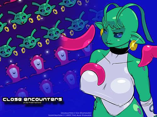
Thank you for visiting. Here's a view of the latest wallpaper I have finished. Again, I am disappointed in myself. This is a terrible homage to the original artist's characters and it took far too long to illustrate it. I am also forced to ask if my methodology is too labor-intensive or complex; given that the professionals can chug illustrations even better than this out in but a fraction of the time, I am left to wonder if I should refine my methods. This is a reduced-resolution and slightly-censored version of the wallpaper for forum posting. Sorry, folks; no links. Those of you wishing to see the entire submission are on your own. Again, thank you for the visit. Feel free to comment. |
|
|
|
Post by The Mad Plumber on Nov 9, 2009 1:30:45 GMT -5
Thanks for visiting my blog again, fellow evil-doers. Today, I'd like to share something that I completed a while ago, which I am at the current time trying to sell at the flea market. Some time ago, I visited the flea market and looked at my picture display. I was a little dismayed that the labels that a placed over my frames illustration were curled up slightly because people were turning them up to see the parts that I was censoring out. I was a little annoyed at first, but I suppose that I should feel honored that at least my illustration was apparently interesting enough to inspire people to want to see it in its entirety. Nevertheless, the item hasn't sold yet ... if ever. I have scheduled a few new projects in my database to take advantage of the Christmas season. I was also initially thrilled when I was told that a customer wanted to commission me, but that customer has yet to return with the deposit and subject. The image above is a reduced-resolution version of my drawing censored for forum posting. Sorry, folks: no links. Those of you who wish to see the whole submission are on your own to find it. I've also taken some of my old graphic pencil renderings and composed wallpapers utilizing some of the generic backgrounds I draw on occasion. I wanted to see some new wallpapers cycled on our computer desktop, plus I thought that making some wallpapers would be a good means of making my works known. Here's links for some of the wallpapers. Marty Feldman in Graphites (Wallpaper Edition) Dad in Graphites (Wallpaper Edition) Dad in Graphites (Wallpaper Edition) Again, sorry, but I cannot provide links to the other submissions. On a final note, fellow MST3K board member Satchmo indicated to me in another thread that he also was into illustration and that he also shared his works online. So, I thought I would share a few of my favorites from his gallery, which I find to be very interesting renderings. I previously provided links to Satchmo's works in this post, but I can't do this anymore. I do not want other users to fall victim to the destructive malware that deviantART had beset on me. Those of you curious to see such submissions are on your own to find them. Take my warning, though: deviantART could ruin your computer.Again, thank you for the visit. |
|
|
|
Post by The Mad Plumber on Nov 27, 2009 9:39:29 GMT -5
Thank you for visiting. Now, for a project that had me working well into late this morning to finish ... I have framed this illustration and am attempting to sell it at the flea market. I hope my work pays off. This is a reduced resolution version of this artwork for forum posting. Users interested in seeing a higher resolution version can visit the following link. Again, thank you for the visit and have a safe holiday season. |
|