Post by BJ on Oct 24, 2011 22:30:48 GMT -5
Here's the story. Ever since I made all those wacky fake Criterion covers awhile back, the idea of making real covers has been gnawing at my brain. About 6 weeks ago while surfing some big (for Florida) waves, I took a fall and separated my ribs in a few places. For about 10 days, all I could do was sit in a chair. Getting up was an ordeal, I couldn't lie down, I slept maybe 3 hours a night... you get the deal. The pain made it too tough to focus on movies, so all I did was sit with my laptop trying to think of things to do. So, I became obsessed with making these covers. I'm not sure how much interest there is in something like this, but I figure it's worth sharing. They're all done, but I still have to do the final editing checks on them, and doing the previews takes some time, so I'll try and post three a day.
A few notes on the covers, in random order
-with a few exceptions, I redid every cover so that the resolution would be at printing quality. Sometimes, I couldn't find the original photos I used, or they weren't large enough, so I used something new to make a similar cover. Also, the shadowrama made things a bit difficult. Titles couldn't be too low or Joike's hand would get in the way, and there couldn't be any true black on the bottom of the cover.
-Some of these are complete redos, as I felt the original wasn't that good, or was too much of a one line joke. Also, since there are a number of movies done in KTMA and the later years, I had to make a second cover for those films. I think I now hate Sandy Frank as much as Best Brains do.
-For anyone thinking of printing these, I haven't tested them myself because my printer's out of ink. I've made and printed a lot of covers, so they should be good, but none of my monitors are calibrated for printing.
-For each cover, I'll try to add a little info behind the creative process, and how/why it's different from the original fake Criterion
-I did all my own editing, so there's bound to be some mistakes no matter how many times I double check. Feel free to point out any errors.
- the running times on the back are all from the Archive copies. Your mileage may vary.
-While going through all these, I noticed only a few of them really had a Criterion look to them. Oops. While they have some beautiful covers, I feel Criterion has a tendency to make the most boring and uninspired covers of all the distributors. I just didn't want to make almost 200 covers that were a picture of someone's face with a simple font and maybe half the cover in a different color.
-For some reason, I used Japanese text for all those monster flicks, but no other foreign lanugages. I have no knowledge of the language, so it probably isn't right, but my Bry and Adams bootleg cd makes me think it's ok to send a little Engrish back toward Asia.
- The full size covers posted are slightly compressed, but in my experience, not enough to make a noticeable difference in quality. They have to be under 5 MB for most image sharers, so it's tough to avoid.
- I didn't want to write my own descriptions for the back, as I thought my own tastes, writing style, and sense of humor would grow stale over so many write ups. So, for most of them, I took the Brains thoughts from the ACEG. For those without entries, I took text from Castle Forrester or some other writeup. It would have been nice to have my own stuff, but I didn't want every Bridey Murphy episode to have "I f**king hate hypnotists" as the description.
Anyway, that was long and boring, so here are the pictures.
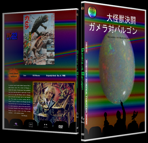
KMTA 4 - Gamera vs Barugon
-Same as the fake Criterion. The only thing I ever take from this movie are rainbows. I think the Rolling Stones wrote a song about Barugon
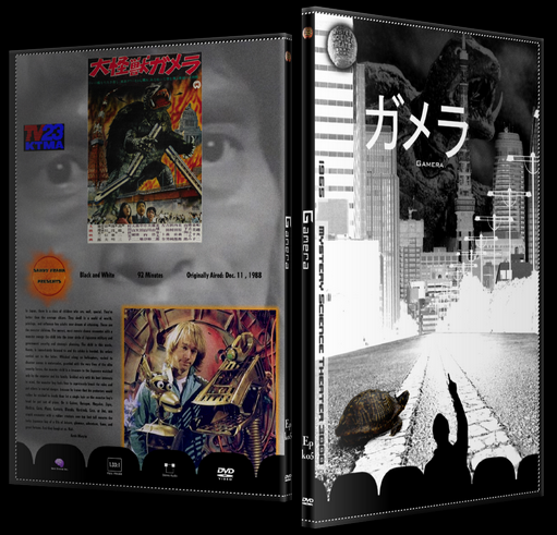
KTMA 5 - Gamera
- Same ol, but I added Gamera in the background. I just like the way it looks. This is one of my favorites, not because of what I did,, but because only Joel is in silhouette.
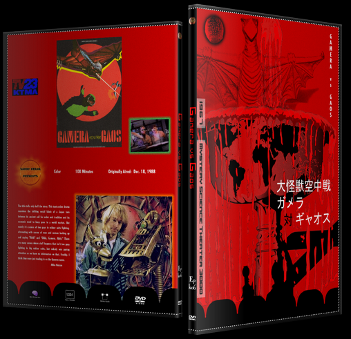
KTMA 6 - Gamera vs Gaos
- This one's new, because I wanted all the main series Gamera covers to have the same look. The first thing that pops into my head with this movie is land dispute. That's not inspiring, but the second thing is vampirism and blood fountains. So, there ya go.


A few notes on the covers, in random order
-with a few exceptions, I redid every cover so that the resolution would be at printing quality. Sometimes, I couldn't find the original photos I used, or they weren't large enough, so I used something new to make a similar cover. Also, the shadowrama made things a bit difficult. Titles couldn't be too low or Joike's hand would get in the way, and there couldn't be any true black on the bottom of the cover.
-Some of these are complete redos, as I felt the original wasn't that good, or was too much of a one line joke. Also, since there are a number of movies done in KTMA and the later years, I had to make a second cover for those films. I think I now hate Sandy Frank as much as Best Brains do.
-For anyone thinking of printing these, I haven't tested them myself because my printer's out of ink. I've made and printed a lot of covers, so they should be good, but none of my monitors are calibrated for printing.
-For each cover, I'll try to add a little info behind the creative process, and how/why it's different from the original fake Criterion
-I did all my own editing, so there's bound to be some mistakes no matter how many times I double check. Feel free to point out any errors.
- the running times on the back are all from the Archive copies. Your mileage may vary.
-While going through all these, I noticed only a few of them really had a Criterion look to them. Oops. While they have some beautiful covers, I feel Criterion has a tendency to make the most boring and uninspired covers of all the distributors. I just didn't want to make almost 200 covers that were a picture of someone's face with a simple font and maybe half the cover in a different color.
-For some reason, I used Japanese text for all those monster flicks, but no other foreign lanugages. I have no knowledge of the language, so it probably isn't right, but my Bry and Adams bootleg cd makes me think it's ok to send a little Engrish back toward Asia.
- The full size covers posted are slightly compressed, but in my experience, not enough to make a noticeable difference in quality. They have to be under 5 MB for most image sharers, so it's tough to avoid.
- I didn't want to write my own descriptions for the back, as I thought my own tastes, writing style, and sense of humor would grow stale over so many write ups. So, for most of them, I took the Brains thoughts from the ACEG. For those without entries, I took text from Castle Forrester or some other writeup. It would have been nice to have my own stuff, but I didn't want every Bridey Murphy episode to have "I f**king hate hypnotists" as the description.
Anyway, that was long and boring, so here are the pictures.
KMTA 4 - Gamera vs Barugon
-Same as the fake Criterion. The only thing I ever take from this movie are rainbows. I think the Rolling Stones wrote a song about Barugon
KTMA 5 - Gamera
- Same ol, but I added Gamera in the background. I just like the way it looks. This is one of my favorites, not because of what I did,, but because only Joel is in silhouette.
KTMA 6 - Gamera vs Gaos
- This one's new, because I wanted all the main series Gamera covers to have the same look. The first thing that pops into my head with this movie is land dispute. That's not inspiring, but the second thing is vampirism and blood fountains. So, there ya go.