|
|
Post by pslowner on Jan 13, 2008 15:00:03 GMT -5
Yessir, it is Mitchell. Since that was the last Riff that Joel did, it seemed appropriated.
I am going to try and add some scuff marks, gashes, maybe a bit of rust to the CT logo sign and see what that does.
|
|
|
|
Post by pslowner on Jan 13, 2008 18:45:00 GMT -5
Updated...... still a WIP  |
|
|
|
Post by archhall3 on Jan 14, 2008 10:08:49 GMT -5
I hope its not Sheriff Geronimo!
|
|
|
|
Post by zardozapp on Jan 14, 2008 17:59:20 GMT -5
Hello, back again, and i have another cover to share. Hope some of you will find it useful. Comments and opinions are always welcome. ;D  |
|
|
|
Post by pslowner on Jan 14, 2008 18:47:37 GMT -5
I think I put in everyone's suggestion. Tempted to go too crazy with distressing the CT logo sign and putting too many stickers on it...... Unless someone has any other suggestions, I think this might be done. Any comments? I think we have another month before the next release, so there is time to tweak. pslowner.smugmug.com/gallery/2651674#243481932-L-LB |
|
|
|
Post by pslowner on Jan 15, 2008 15:27:34 GMT -5
|
|
|
|
Post by blueskieseyes on Jan 15, 2008 16:29:45 GMT -5
Nice work, all!  |
|
|
|
Post by wilson on Jan 16, 2008 5:31:35 GMT -5
While I wait ( and wait ) for my absurdly delayed Oozy Skull , I anticipate actually having a disc to put in a DvD case , and I combined elements of a couple from this thread. Hope that's ok ! 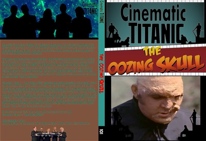 |
|
|
|
Post by Miss Interoceter on Jan 16, 2008 9:54:16 GMT -5
If you print that out, can you actually read what's on the back? It's very glowy on my screen.
|
|
|
|
Post by wilson on Jan 16, 2008 16:38:48 GMT -5
If you print that out, can you actually read what's on the back? It's very glowy on my screen. I think so. It was a hard one, cuz the background color was quite patchy and bled into the letters ( which were far from pure black ) That shade of aqua was just too bright for me , but at full-size I found it readable ! |
|
|
|
Post by pslowner on Jan 16, 2008 17:16:59 GMT -5
Guys, thank you all very much for your comments and suggestions. All of them (that I knew how to do in Photoshops Elements anyway) made it in the design and I wanted to say how much the comments were appreciated. I think I have tinkered with this enough now and it is done. I can see how having the Mitchell poster works for some, does not for others. So I have placed both a regular and a "Mitchell-less" version in the below link. For the second release, the Brain of Blood The Oozing Skull poster will be the one cut in half on the left hand side. Please feel free to download if you like. pslowner.smugmug.com/gallery/2505605#P-3-20  |
|
|
|
Post by wilson on Jan 17, 2008 19:27:04 GMT -5
If you print that out, can you actually read what's on the back? It's very glowy on my screen. I just printed mine ( yay ! ) and it did indeed come out less "glowly" and perfectly legible. So that's pretty cool. |
|
|
|
Post by RexDart on Jan 17, 2008 20:02:22 GMT -5
i noticed on one of those covers you can see all of Josh on the left. On my tv, Josh is cut off a little, sucks  |
|
|
|
Post by Bix Dugan on Jan 18, 2008 12:03:52 GMT -5
i noticed on one of those covers you can see all of Josh on the left. On my tv, Josh is cut off a little, sucks RexDart (great username, btw), if you move your seat to the left a bit, that should help. |
|
|
|
Post by tenbears66 on Feb 1, 2008 18:06:35 GMT -5
Nice cover but I modified some of the text to add emphasis.  |
|