|
|
Post by BJ on May 1, 2011 18:21:12 GMT -5
I'm really bored today. That happens when your front crown gets knocked out (and the tooth for that matter), you can't see the dentist until Monday, and you're too embarrassed to be in public with Fixodent barely holding it in place. Anyway, since I don't have any more fake Criterion covers to post, I thought I'd post some of the real covers I've done. I often buy used movies in the bargain bin with no cover, or I just hate the covers the studios put out, so I'll just make my own. It's not only a fun exercise, but I love it when a music or movie cover seems to work together with what's inside. The various covers for Jaws are a great example of this. The current, holographic slip cover for the Terminator, with a terminator that clearly isn't based on Arnold? Well, that's just horrible. Fortunately, in that case, the real cover underneath was decent. Well, this is my most recent, so Ill start with it. The actual cover for this is great, but I don't own the DVD. I just digitally transferred my vhs so I needed a cover for it. The front is a European poster, which I love, and all I had to do was change the language. I learned of this movie through Austin Powers and Sublime's Smoke Two Joints song, and I had to see it. It's since become one of my favorite guilty pleasures.  If anyone makes, or has made, their own covers. Please share. I'd love to see them. |
|
|
|
Post by The Mad Plumber on May 2, 2011 19:18:32 GMT -5
First off, I'm very pleased that the administration has pinned your Criterion thread to this folder. It's a well deserved honor for such hard work and amusing material.
I was thinking about opening a thread about Photoshopped covers for DVD ... though it wasn't necessarily going to be a positive one. This isn't necessarily to say anything bad about your covers; it was more or less my frustration that I would get DVDs that have these terrible Photoshop covers as opposed to the original poster art as your would see on a VHS tape release. It leaves me to wonder as to whether it has to do with licensing issues or other costs. It leaves me to ask, "Why can't you just commission an artist to draw new cover art? Disney does it all the time."
This is to say nothing bad about your cover. It looks quite artistic and professional. Of course, I don't quite see a designated space for a UPC bar code. I like the vector overlap in the upper left corner. I'd certainly like to see more covers.
This gets me to thinking about writing articles critiquing to composite of DVD covers.
|
|
|
|
Post by BJ on May 2, 2011 20:08:15 GMT -5
That first line confused the hell out of me, that is until I explored and noticed the thumbtack on the Criterion tread. Needless to say, I'm honored. Anyway, the rest of your post makes perfect sense. Poorly copied covers are a major problem in the industry, and one of many reasons I make my own. This thread from the Criterion forum www.criterionforum.org/forum/viewtopic.php?t=575 highlights some of the worst covers ever made, and includes many such examples. If you, or anyone else wants to bitch about rubbish covers, I think this thread would make a great place. As far as bar codes go, I absolutely hate them. It's a bit of controversy for people that make custom covers, as many feel it makes them appear more official. However, I'll never put one on. To me, it's like those stupid "Explicit Lyrics" warnings they slap on cds. They're ugly and stupid. This is one of the worst covers I've ever seen, from the Criterion thread. I simply could not stop laughing when I saw this, to the point where tears were running down my face.  |
|
|
|
Post by The Mad Plumber on May 4, 2011 22:05:49 GMT -5
My god! That's not even Photoshop! That's MS Paint! Buh!
I've looked through that thread. It's a little interesting, but it seemed like folks were just picking DVDs for the absurdity of their content as opposed to the composition of the cover art. I also saw a lot of the image links were dead. The best post I liked from that thread was the commentary on the Ghostbusters DVD which detailed the faults of the graphics design ... and I agree with every point.
So, I'll look through a few DVD covers to scan and comment on.
|
|
|
|
Post by BJ on May 4, 2011 23:14:56 GMT -5
^Yea, the dead links were a shame, and there was a lot of merely obscure stuff like you said. That Ghostbusters post stood out to me as well. It never really bothered me, probably because i got it for $7.50 last year when I realized the Blu-Ray picture quality was so bad, but it really is terrible. Someone's probably already made a good one, but that might be my next project. Here's one I did awhile back for Dark City, completely from scratch. I never thought the DVD cover really worked, but the Blu-Ray cover is just plain awful, so I replaced it as soon as I could. If I did this one today, it'd definitely be more polished, as I'm not sure about the font or the newspapers, but I still like the basic design.  |
|
|
|
Post by The Mad Plumber on May 10, 2011 19:03:02 GMT -5
To be honest, I'm not too impressed with your Dark City cover as I am with your Valley cover. The one criticism I was going to lend to it was the lack of anti-aliasing on the film title. Still, a noble early effort. Well, here's a criticism of a commercial DVD cover. Here's the first thing that I'm going to criticize and I think my criticism will be a constant for all DVD covers that perpetrate this: critic sound bytes. I don't think that a good review can be condensed into a little sound byte. I wrote a review of New Cutey Honey that went on for several pages, which is probably far more than most anime critics would dedicate to such an anime. Now, this might lend myself to hypocrisy since I might take honor if someone cited my review on a Cutey Honey box. However, I don't think there was anything in my review that could be condensed as a six-word summation of my opinions of the series. Here's some problems with having critic sound bytes on a DVD cover. (1) You own the DVD. Somebody else's opinions on the movie are largely irrelevant because, since you're the one who watches it, the only opinion that matters is your own. (2) I generally don't pay attention to most mainstream critics anymore. After having been led down the dark paths of Giant and Breakfast at Tiffany's, I have little reason to trust their insights these days. Typically, when I want a critic's opinion (and I do vie for them, though from more obscure sources), I get the opinion from the horse's mouth and THEN go see the media based on the recommendation. (3) You can get a good review for virtually ANY film. For example, there seems to be a legion of people who purport Cowboy Bebop: The Movie as being "the greatest anime ever" in spite of the fact that I think it's crap. When I see the joblo.com review on this cover, my first reaction is, "What the hell is joblo.com?" Here's the amusing thing: I recently went to the video rental to pick up Donkey Kong Country and Tron Legacy. Just for giggles, I wanted to see if they had The Last Airbender in stock since I had heard from numerous sources how horrendously bad the film was. I was amused that there was a joblo.com sound byte on the Airbender DVD which painted the film in a positive light. The graphic for the front cover is pretty simple: a shot of Stallone's face. The photo looks pretty gritty, showing off facial hair stubble and skin pores. Yet, I stand amazed: Stallone in his 50s/60s looks better than me in my 30s. I have a problem with the titling of this film. "Rambo" is the relaxed name I tend to use when referring to First Blood. If there's a sequel, what's it going to be called? I don't have a problem with the Photoshop collage in the back. Overall, there seems to be a real absence of color in this cover; I could be wrong and my colorblindness might be to blame. I have to bemoan the "Proof of Purchase" area up top. Also, the data on the bottom looks real cluttered. Just how many company names are they going to list? In the end, the cover ranks as okay because they went with simplicity over a Photoshop collage. However, without the aid of the title, could your tell if this was a cover to Rambo or Rambo: First Blood Part II? |
|
|
|
Post by BJ on May 10, 2011 20:45:16 GMT -5
I've always had trouble with the titles of the John Rambo films. First Blood sounds like it might be a prequel, and then they went with Rambo: First Blood Part 2, which is a quite a mouthful. I think you're right about the title of the newest one. Rambo is so generic, and with no subtitle, doesn't stand out among the rest. I guess they figure people will see Rambo on the shelf, recognize the name, and buy it over the others. And you're dead on about the desaturated color. I guess they were going for a gritty look, but on the shelf it looks strange. The critic blurbs you mentioned are always a pain. I guess they move merchandise, but they look like crap, and I don't pay attention to professional reviews anymore. My favorite is when they use some random comment from imdb, as if that means something. I recently watched Love the Beast, so I'll share the original cover as well as my own. You can tell the artist made a fantastic cover, and it's better than anything I could do. The artwork's great, the photographs on the back give you a great idea of what's inside. It's not too busy. Then, legal and marketing just threw up all over it, with Australia's gov't warnings, a bunch of quotes, an award logo, three separate studio logos, and Bana's name twice on the cover. It just looks like hell. 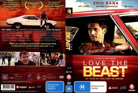 Since I liked the cover to start out, I just cleaned it up and simplified. It's made even more simple since I had to download this when I got it, as it was out of print at the time. That means no special features at all, no region restrictions, etc. The back of this would never pass muster at a commercial level (it almost looks like a book jacket), but it works for me as all the necessary information is easy to see. On the plus side, I was able to remove all mentions of Dr. Phil McGraw. I had to shrink this down to upload it, so on the 1 in a billion chance someone wants to print it out, shoot me a pm.  |
|
|
|
Post by BJ on May 14, 2011 16:46:07 GMT -5
|
|
|
|
Post by The Mad Plumber on May 19, 2011 16:45:20 GMT -5
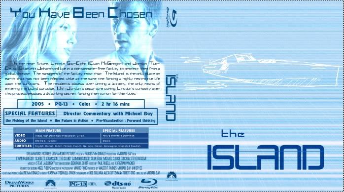
The Love the Beast cover is a dramatic improvement over the original. It's much more attractive and a lot less cluttered. My feelings on your Island covers, though, are mixed. For me, it's a little hard to see the white illustration on the bright blue covers. Also, and it's hard to explain, the covers look more like book covers than DVD covers. The data on the back of the covers, though, looks reasonably organized. Thanks for posting those. I find it a little hard to believe that there isn't any Japanese poster art that Disney could have utilized as opposed to a still from the film. Furthermore, the still utilized for the front seems the least representative of the film's content. Where Porco's plane? If I was to judge the movie by the front image, I would assume it was about a pig version of Inspector Clouseau. The complete absence of critic blurbs helps out immensely. Fortunately, we do see Porco's plane on the back. Unfortunately, in this case, we have three proof of purchase spots above the UPC code. The data is nicely organized, though I might bemoan all those logos occurring under the film credits. I wonder if so much space was needed for the suggested audience section; usually, when the material is too extreme for family watching, Disney would release the picture under a Miramax label. In the end, this is a satisfactory DVD cover, but not a spectacular one. |
|