|
|
Post by Pete on Jul 13, 2007 0:10:18 GMT -5
Some new stuff to see, and more coming soon. Here is the new logo/main title for The VHS Hole (I've decided to ditch the periods in V.H.S). It still needs color and the full opening title sequence will be much more animated. Feedback would be very appreciated.  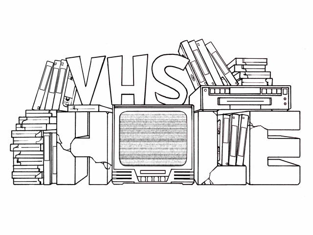 |
|
|
|
Post by GProopdog on Jul 13, 2007 10:40:32 GMT -5
I like it
it should look even better once the color is brought in.
|
|
|
|
Post by cambot01 on Jul 13, 2007 12:59:34 GMT -5
Looks good.
|
|
|
|
Post by Pete on Jul 14, 2007 14:34:08 GMT -5
Thanks guys. The animation for the title is soon to be done. Also, the static on the TV will be replaced with clips of various films that I would like to use for the show, or at least have goofy scenes. I'm going through my collection and finding the best stuff, it's a more time-consuming process than I anticipated. I think it'll look pretty cool when it's done. |
|
|
|
Post by GProopdog on Jul 14, 2007 14:48:50 GMT -5
Once you need some more riff writing to be done Pete, just drop me a PM.
|
|
|
|
Post by wilson on Sept 17, 2007 16:28:22 GMT -5
Just left the following for "Cathy's Breakfast" on YouTubed
I went well 500 characters , so the edit down may be, oh, herk-jerkity ?
( damn ! . . should'a saved it THeN edited . . paste the whole thing here too, ah well )
===:
Just here from "Crow's Art" ..[ Big Stoopid here ] and I 2nd all the notions above.
Back on the boards ,in`06, a lot of your 1st repliers immediately offered new plot points / motivations for Dot's "reasons"
Phooey ! My 1st read of your 'proposal' didn't find anything missing in the premise a'tall !The outcome is great so far.
The only touch I found off was the voice of the grouchy cactus came out a little loud and especially a tad slow in spots,
Are you doing all the crew yourself ?
|
|
|
|
Post by Pete on Sept 17, 2007 17:12:50 GMT -5
Thanks, Big.
Yeah, I'm still working on the technical stuff, it's been a challenge. I'll admit I've been lazy and distracted with other interests for awhile, so I haven't made much progress lately, but I always know this would be slow going.
To anybody still interested in The VHS Hole: It's not dead, it may still be a long time before it becomes a regularly produced show, and the final show may be different than original concept (I'm considering simplifying it) but it's not dead.
|
|
|
|
Post by Pete on Sept 17, 2007 18:43:25 GMT -5
HERE is the same teaser I posted before using Why Doesn't Cathy Eat Breakfast?, except now I added an animated silhouette. Now, it's not synced up with the riffs, but this what it will look like. I found a better, cleaner way of inserting the silhouette than I had used on the other test I posted in this thread earlier. Baby steps...
|
|
|
|
Post by wilson on Sept 17, 2007 21:38:21 GMT -5
Baby steps... good...goood c'mon, yes ! who's a big boy ? ye-e-e-e-s Do you hope to get the "shadowrama" to the point of 'acting', or is that one a' those steps you're still approaching ? |
|
|
|
Post by Pete on Sept 17, 2007 22:25:58 GMT -5
Do you hope to get the "shadowrama" to the point of 'acting', or is that one a' those step you're still approaching ? I definitely intend for the characters to "act" in silhouette. Barnaby (the cactus on the far left) is the only one whose mouth can be seen, so only his riffs need to really sync up, but the others will move when they speak. Also, they will occasionally react physically to the film when it's called for. Thanks for asking |
|
|
|
Post by wilson on Sept 17, 2007 23:28:35 GMT -5
Good, otherwise people end up focusing on the static nature of it, then tune it out.
Sure, got's to be part a' the flow, or it negates itself.
yup
|
|
|
|
Post by Pete on Sept 21, 2007 14:04:23 GMT -5
Another step in the right direction - Here is the completed version for show's logo/main title: 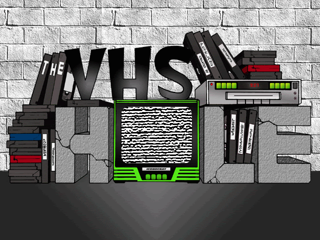 I know what you're thinking: "Not very colorful". That's intentional. The show is set in a dark, dingy basement, so I wanted the logo to give that impression. In the logo most of the color comes from the TV, just as the only "color" on the show comes from the films they watch. I didn't go crazy with detail either, with shading and whatnot, but tried to add just enough to give some solidity to it. Any comments, criticism and/or suggestions are, as always, welcome. Thanks!  |
|
|
|
Post by wilson on Sept 21, 2007 18:47:10 GMT -5
Another step in the right direction - Here is the completed version for show's logo/main title: I know what you're thinking: "Not very colorful". That's intentional. The show is set in a dark, dingy basement, so I wanted the logo to give that impression. In the logo most of the color comes from the TV, just as the only "color" on the show comes from the films they watch. I didn't go crazy with detail either, with shading and whatnot, but tried to add just enough to give some solidity to it. Any comments, criticism and/or suggestions are, as always, welcome. Thanks! Color pallette is fine & proper . . . I'd even have a descending murky shadow over the back wall. Bring out the "only light sorce beaming from the set" more. Then the chosen colors on the tapes would "gain some glow" also. ? |
|
|
|
Post by wilson on Sept 21, 2007 18:48:51 GMT -5
plus , the letters for "Hole" would, as they say , "pop" .
I had to look twice squintfully to see where "The VHS ..." was completed.
|
|
|
|
Post by Pete on Sept 21, 2007 19:30:55 GMT -5
Thanks, BS. It does still need tweaking. Good suggestions. The brick wall was actually the last part added, almost as an afterthought. I will probably add a bit of shadowing there. On a related note (well, related to the show anyway), I just (and I mean just) started a website for The VHS Hole HERE, not everything is working yet, but I'll be adding a lot more in the following days. Please stop by. Thanks! |
|