|
|
Post by BJ on Nov 13, 2011 14:03:03 GMT -5
Wow! Sorry it took an injury to spark these, but they're excellent. By the way, if you ever want to check any Japanese text, lemme know. Thanks. Amazingly, I still have a sore spot on my ribs. I guess the lesson is, don't fall down. And believe it or not, I almost sent you a pm about the Japanese text. I had a brief thought about making them accurate, couldn't think of anyone I know in real life who knows Japanese, so you came to mind. In the end, I thought "What would Sandy Frank do?", so copy and paste was the answer. I tried to use the posters to match up spacing, and I figured any mistakes would fit with the quality of the dubbing. I'm a Grimauld warrior! 317 - The Viking Women and the Sea Serpent -same style as before. The actual title for this film is so stupid, it's like it was done on a dare. Then you realize this is a Corman production. 318 - Star Force: Fugitive Alien 2 -copy and paste of the original, since it took a long time to make. It's just a straight ripoff of the Yojimbo cover. 319 - War of the Colossal Beast -same as before. Glen likes to eat bread! With, Mr. BIG, Albert Glasser, and Mr. B, the back is quite busy. Also, Mike is amazing again as a guest to the SOL. Here's the source of that fantasic Mr. B drawing.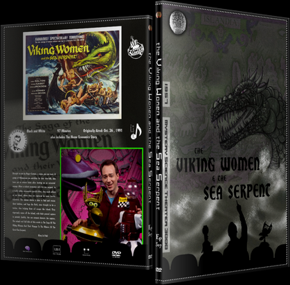 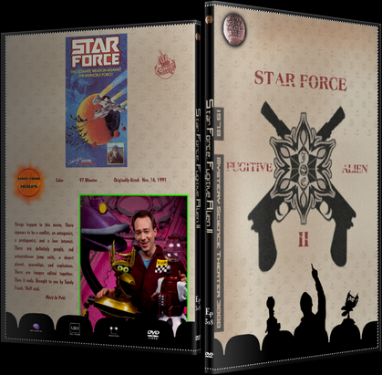 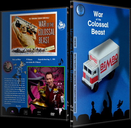    |
|
|
|
Post by caucasoididiot on Nov 13, 2011 15:52:06 GMT -5
You seem to have gotten all the Japanese right anyway, but I'd be honored to assist this project in any way. By the way, you can now never work for Sandy Frank, having demonstrated over-competence.
I love the Mr.B on the back of WotCB. That's avatar material!
|
|
|
|
Post by CBG on Nov 14, 2011 7:54:47 GMT -5
Hey, plissken, just somethin' to think about...We also need covers for SHORTS VOL I , II, III...and Mr. B's Shorts...any chance? EDIT: Wow...I just reread that, and it sounded so DEMANDING!  What I mean to say was, I love your covers so much, I was hoping you would be able to include covers for the various Shorts DVDs. The thought occurred over the weekend whilst I was enjoying said discs with my offspring. I thought, "Wow, I wonder how plissken would create a cover for the Shorts DVDs?"...or something like that.  Anyway, once again, awesome work fellow MSTie. |
|
|
|
Post by BJ on Nov 14, 2011 10:34:37 GMT -5
By the way, you can now never work for Sandy Frank, having demonstrated over-competence. Ha, that's great. There is one cover I'm thinking of fixing, and it has Japanese on it that I'm not sure of at all, so you might still be able to lend a hand. And it's not even a Sandy Frank film, which is nice. Hey, plissken, just somethin' to think about...We also need covers for SHORTS VOL I , II, III...and Mr. B's Shorts...any chance? EDIT: Wow...I just reread that, and it sounded so DEMANDING! No need to apologize, although it's refreshing to hear someone on the Internet actually worried about offending someone. On other forums, it seems as if tact is a foreign concept, which is probably why I continue to come here, and eventually stop visiting most other places. Anyway, I'll think about the Shorts. I don't actually have any of those sets, since I always just watch the episodes, so I never considered making those covers. Also, compilation covers are very difficult to pull off. For instance, I made a Bourne collection cover that I love, and I have customs of Transporter and Ocean's that are great, but the cover I made for the first three Jack Ryan movies is kind of a dud. The difference is that Bourne, Transporter and Oceans all have the same principal actors, with similar plots. For Ryan, the actor, character and style all changed when Baldwin was swapped for Harrison Ford. That made it hard to come up with a meaningful cover to present all three films, and it wound up being a cluttered mess. For the shorts, there's nothing tying them together other than their appearance on MST. That makes it even more difficult. This is way too long, so if you just skipped to the end, I'll think of ideas for Shorts covers, and any other requests, and post them after Diabolik. They just might not be very interesting. |
|
|
|
Post by caucasoididiot on Nov 14, 2011 10:45:48 GMT -5
Y'know, Crow's Art is one of the areas I tend to forget about for long periods. I hadn't even seen your Criterion thread, which I'm now about halfway through. I hereby officially upgrade "excellent" to "brilliant." There is one cover I'm thinking of fixing, and it has Japanese on it that I'm not sure of at all, so you might still be able to lend a hand. And it's not even a Sandy Frank film, which is nice. Absolutely! Were you able to get the Japanese character strings to work with or did you just work with them as images? I have a good selection of J-fonts too, so if you want to play around with different looks, that's doable. Now I'm back to the Criterions (Criteria?). Thanks for getting my day off to a great start. |
|
|
|
Post by CBG on Nov 14, 2011 10:48:58 GMT -5
Another question...pardon me if you've already addressed this, but what kind of paper do you recommend using to print these? I've tried standard printer paper, and the colors just go blah.
I'm sure some glossy stock would work, any recommendations?
|
|
|
|
Post by BJ on Nov 14, 2011 12:42:50 GMT -5
Absolutely! Were you able to get the Japanese character strings to work with or did you just work with them as images? I have a good selection of J-fonts too, so if you want to play around with different looks, that's doable. Glad you like the Criterion thread. It'll be a lot of the same as this one, but there's some differences. I actually was able to get the Japanese characters to work, which surprised me. I don't think there was much difference in what font I used, but at least I was able to resize and edit them easily. The cover I'll need help on is Diabolik by the way, so it'll be awhile. Another question...pardon me if you've already addressed this, but what kind of paper do you recommend using to print these? I've tried standard printer paper, and the colors just go blah. I'm sure some glossy stock would work, any recommendations? I've always printed my covers on the mid range, glossy photography paper. I've tried different brands, never spent too much, and they come out okay. The only problem I find is that they sometimes never fully dry, especially in high humidity like Florida. The dark colors sometimes stick to the plastic, making them look funky. It doesn't damage anything, and it'll go back to normal after lifting the plastic off, but I don't like the way it looks. I'm guessing there's some way to stop this, maybe with heat or something, but I've never taken the time to learn. An alternative is matte photo paper, which is something I want to try, but haven't yet. I'm just not sure where to find it for a good price. You get the color fidelity of the glossy stuff, just without the sheen or the sticky surface. I think it uses less toner as well, but I can't guarantee that. If you can buy that for a good price, I think it's the way to go. Also, a cheap cutting board is a good idea if you don't have one already. I found one at JoAnne's for 6 bucks, and I use it all the time. I can't cut a straight line with scissors to save my life. |
|
|
|
Post by BJ on Nov 14, 2011 13:01:33 GMT -5
and here's today's special 320 - The Unearthly -Same as before. It's nothing exciting, just a shot of Carradine that I liked. In fact, if you look at the poster on the back, it's right there. On second thought, don't look there. It's original, I swear. 321 - Santa Claus Conquers the Martians -This is new, because the original was so low res. As crazy as it may sound, this might be my favorite of all the covers I've ever made. Lots and lots of hubris. I love the font, the glowing joint, the X-Files feel, Joel's hand, the colors, the horror theme for a kid's movie, everything. I also despise the entire notion of Santa Claus, so I love how evil he looks in the drawing I found. I think it traces to my love for the claymation Rudolph, as Santa is as tolerant as a KKK wizard in that film. Then, finding out your parents were lying to you about this all-seeing, judgmental weirdo who breaks into houses and breaks the laws of physics... That was the last straw. Yea, I know, I've got issues, but I still hate Santa. 322 - Master Ninja -This is new as well. I wanted something other than a joke about I'm Max Keller!'s gerbil, but wasn't coming up with anything. I found this on an image search, and really like it, so I stole it. All I did was add a title. Thank you Internet stranger. Your painting is nice. Wow, I'm way too wordy today. I need to either put the coffee down, or write a book. 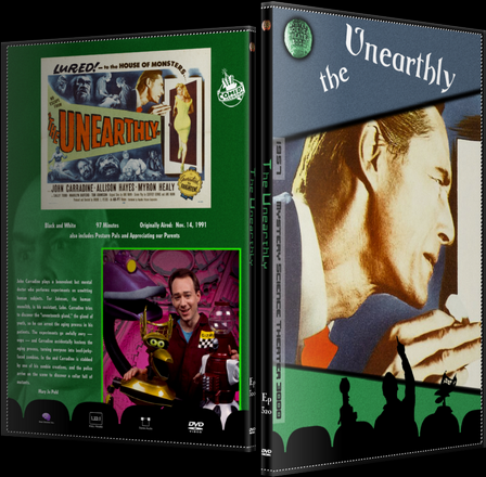 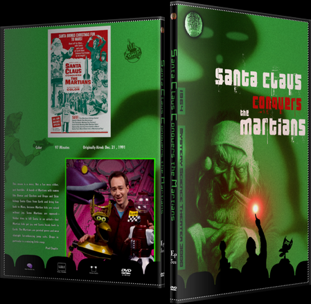 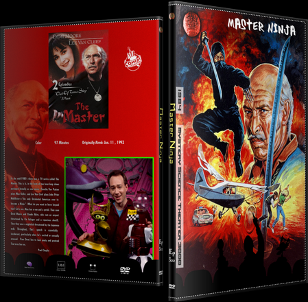    |
|
|
|
Post by caucasoididiot on Nov 14, 2011 13:27:48 GMT -5
I actually was able to get the Japanese characters to work, which surprised me. I don't think there was much difference in what font I used, but at least I was able to resize and edit them easily. The cover I'll need help on is Diabolik by the way, so it'll be awhile. I'll be standing by. I was doing some Goji covers awhile back, and I'm afraid that I don't have any fonts that match that sort of J-Googie look the old posters had. Still, there's a fair range of styles, and I'll try to get a few samples your way so you can see what's there to work with. Who knows? Maybe you'll want to do a Kurosawa festival someday. I finished the Criterions. The problem with looking at everything in one block is that it makes it hard to pick out favorites. Too many laugh-out-loud reveals to remember the specifics! |
|
|
|
Post by BJ on Nov 14, 2011 13:47:21 GMT -5
Ha, I almost made a joke earlier about making a Japanese Seven Samurai cover if the day ever comes when I can afford the Blu-Ray. I guess that shows how influential he is as a Japanese artist with global appeal.
I have that specific memory problem with television dvd sets. If I like the show, I'll rush through it so fast that it all becomes a blur. Movie trilogies can be the same way, since my OCD means I have to watch them all together. I love the Man With No Name films (there's Kurosawa again), but if I had to give plot summaries of the individual films, I'd start stammering and second guessing myself. "Now, Lee Van Cleef's this guy out for revenge...No wait, he's a jerk...No hold on, he's not in that one... or is he a ninja? Ah, I give up."
|
|
|
|
Post by BJ on Nov 15, 2011 13:10:22 GMT -5
You can make comments on these things... that are happening. Here comes a car that you can say something about. It's so... old. 323 - The Castle of Fu Manchu -Same as before. You don't get much more simple than this one. Frank and Dr. F try their hand at riffing for the first time, with awesome results. 324 - Master Ninja 2 -Same as before, based on the Man with No Name artwork. Poor Lee. You deserved better. 325 - Space Travelers -Same ol, but simpler and cleaner. This is based on the Apollo-Soyuz mission patch, for obvious reasons. Every time I write traveler, I think it looks much better with two "L"s. I guess I need to move somewhere in the old British empire. 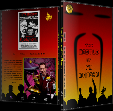 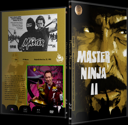 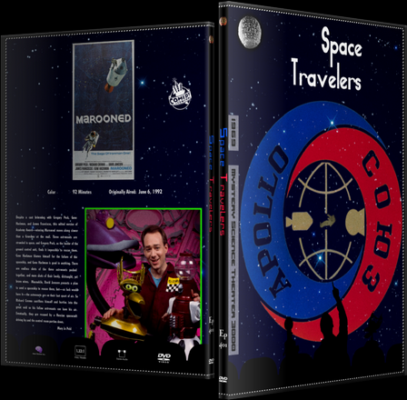    |
|
|
|
Post by BJ on Nov 16, 2011 12:13:30 GMT -5
I sentence you to TORCHA! 402 - the Giant Gila Monster -similar to before, but I had to find a new picture of Capt. Morgan. Get a leg up while you sing, whenever you sing... 403 - City Limits -same as before. Every time I look at the title, I think the perspective is off. Yet, when I tried to fix it, things only looked worse. The lesson is, never try. I noticed the last time I watched Terminator that the first cop killed in the police station is crushed by a desk, which was pushed by a car. Two movies that came out in the same month had desk kills, odd. 404 - Teenagers from Outer Space -same as before. Look at the BONES! 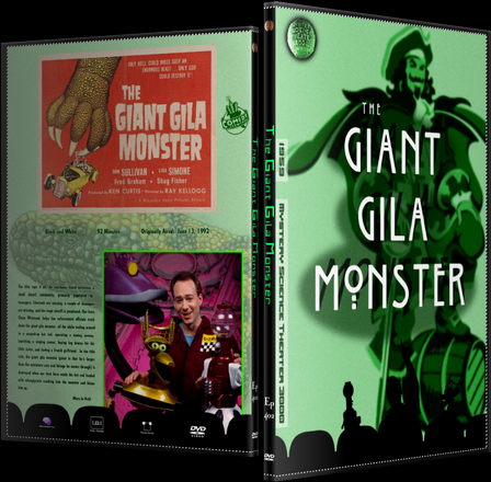 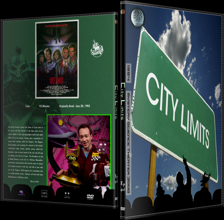 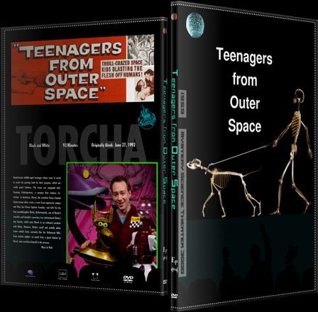    |
|
|
|
Post by caucasoididiot on Nov 17, 2011 0:55:48 GMT -5
'Course, you do know what you've stepped in here, don't you?
Once you finish the MST run, someone's gonna break one of your ribs and hand you a list of Cinematic Titanic titles. (^_^)
|
|
|
|
Post by BJ on Nov 17, 2011 2:40:40 GMT -5
'Course, you do know what you've stepped in here, don't you? Once you finish the MST run, someone's gonna break one of your ribs and hand you a list of Cinematic Titanic titles. (^_^) Ha, I honestly wouldn't mind. The problem is, and I don't know if I should admit this, but I have no knowledge or much interest in CT or Rifftrax. As much as I love the riffing, it was the bots that got me into MST as a kid. If it weren't for the host segments and silhouettes, I'd go mad watching most of these films. I'm impressed that the gang have all found employment riffing post MST3K. But please, don't touch the ribs. It hurts, so much. I don't even want to think of it happening again. If you're in danger, and you can protect part of your body, think about the ribs. Broken arms, bruised face... They heal faster, and everyone feels pity for you. Nobody cares if you tell them your ribs are separated, yet it's weeks before you're free of pain. |
|
|
|
Post by caucasoididiot on Nov 17, 2011 10:11:44 GMT -5
Yeah, sorry, I shouldn't even joke about that. It was very late.
Truth to tell, I've never seen Rifftrax or CT either, for very similar reasons. CT at least has the Shadowrama, but I've always figured they'd feel incomplete without 'bots.
|
|


